

Ink Review: Ferris Wheel Press Lady Rose in Gold
- Jul 11, 2024
- 1 min read


COLOR
Ferris Wheel Press Lady Rose in Gold is a lovely color. I'm a fan of rose gold in general, and I find that they managed to make an ink that does certainly make me think of that color. It is a sandy brown/pink with rosy tones.

CHARACTER

This ink features a decent amount of bright gold glitter. It's a lovely touch that compliments the base color without overwhelming it.
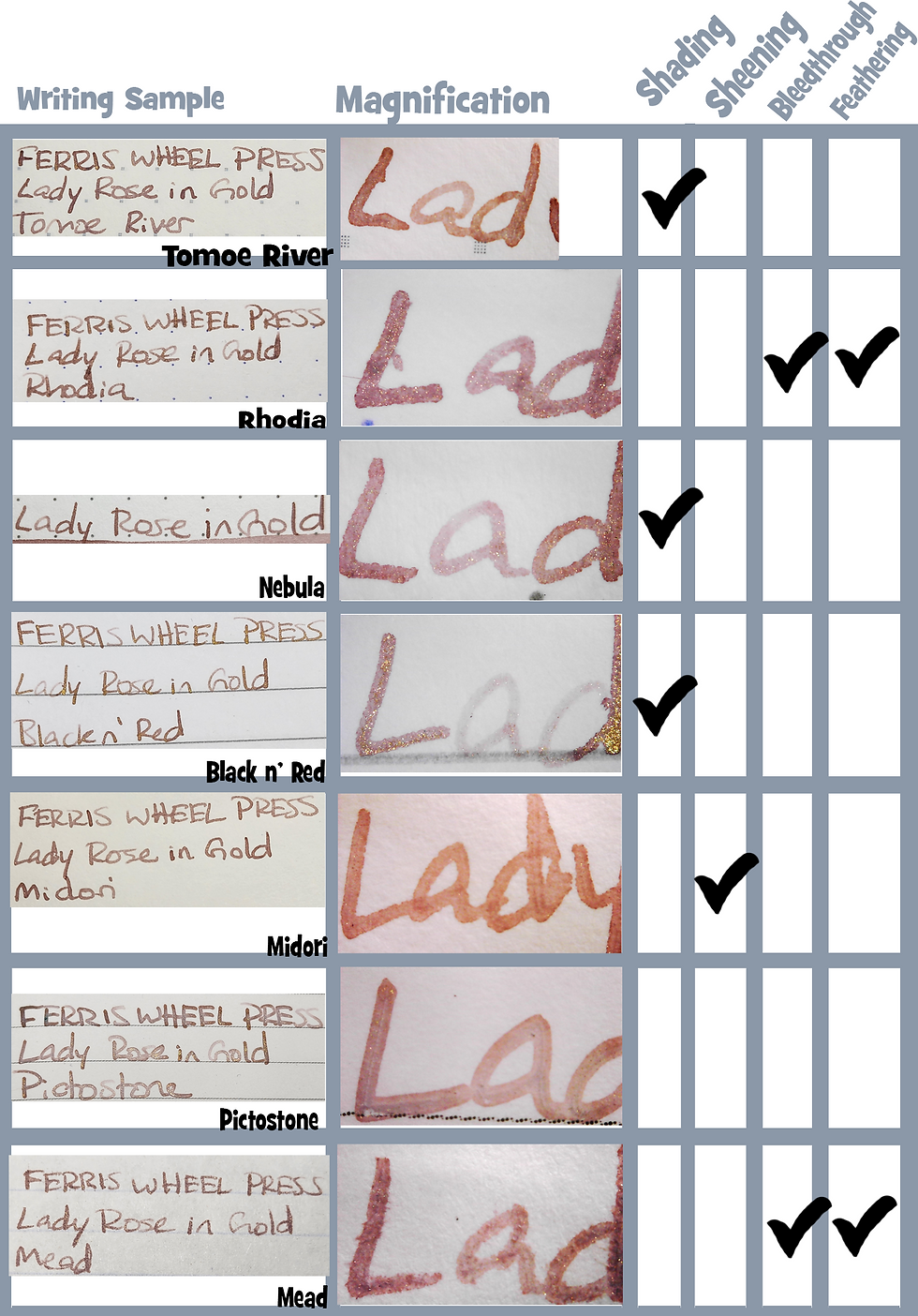
There is a moderate amount of shading in Lady Rose in Gold. I love the difference in tone between the lighter, more pink-leaning parts and the darker brown-mauve.
CONSISTENCY

This ink has normal flow that is slightly on the dry side. It behaves well on paper, though the lighter tones make it a bit harder to read.


Nebula, Clairefontaine, and Tomoe River paper
CONCLUSION
I love using this pen to match with rose gold pens. It matches so well with my Esterbrook Camden in particular. I find that this ink is light and delicate while still making it fun and legible.
DISCLAIMER: Pens and inks purchased by myself. Photos and opinions are my own.


Comments