

Ink Review: deAtramentis Columbia Blue-Copper
- Mar 7, 2024
- 2 min read
Updated: Jun 27, 2024


COLOR
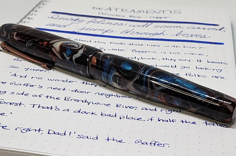
I'm a huge fan of the color combination of a deep blue with copper. This color combination is so pretty! It's interesting - at a distance, when the shimmer is heavy, the combination of copper and blue almost starts to look purple.
deAtramentis also released a version of this blue with gold as well as silver shimmer. I may have to try those in the future, but of course I had to acquire this one first as I really love copper.

CHARACTER

There is a lot of shimmer ink this ink. I specifically use it in pens that are known to write wet, so that they can handle it. For as rich as this ink is, I haven't noticed any sheen, but that may be because of the high amount of shimmer.
CONSISTENCY

This is a decently wet ink. I have used this regularly in pen with a fine nib with no issues, which is surprising considering the amount of shimmer. It definitely has to go in a wet writing pen - smaller pens with more restricted flow will inevitably have some issues.
The copper does settle out pretty quickly, so I find myself having to remember to agitate my pen pretty regularly to keep getting a steady amount of shimmer while writing.


Nebula, Clairefontaine, and Tomoe River paper

CONCLUSION
This ink is such a unique one. It's not that common to see copper shimmer, and it's great! I really want to try the rest of the deAtramentis Columbia Blue series - they have gold and silver shimmer available as well.
deAtramentis is available at some stationery retailers. I purchased this from Goulet Pens.
DISCLAIMER: Pens and inks purchased by myself. Photos and opinions are my own.
Comments