

Ink Review: Akkerman Koninginne Nach-Blauw
- Jan 18, 2024
- 2 min read
Updated: Jun 27, 2024


COLOR
This dusky blue ink is the perfect 'denim blue'. In heavier swatches it starts to lean toward a blue-black, but in writing it is an absolutely gorgeous gray blue. Interestingly, it also subtly shifts based on the paper. On Tomoe River it leans more blue, but on Rhodia some greener tones emerge.

CHARACTER
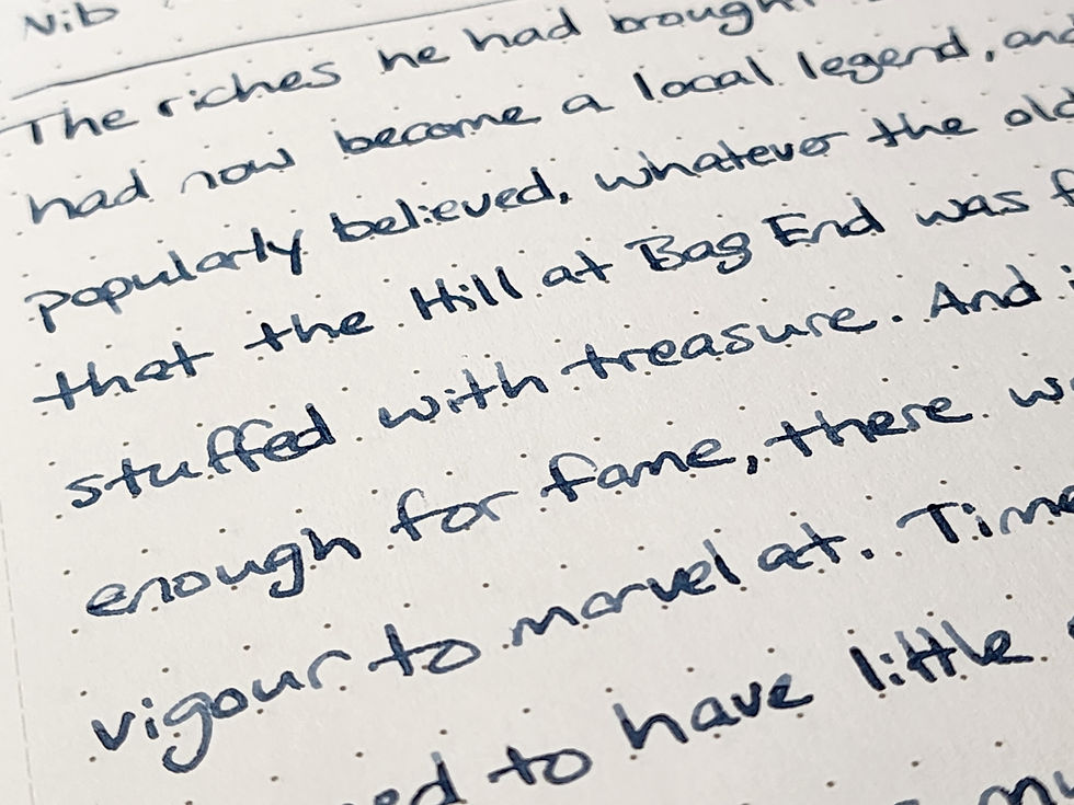
Koninginne Nach-Blauw is a well behaved standard ink. On nicer paper it shows off a delightful amount of shading that brings out the grays in this gray-blue.
I first thought this ink appeared a bit washed out or faded, but after writing with it for a bit I really started to come around.
CONSISTENCY

This ink has fairly normal to slightly dry flow. I like using it in larger nib pens to bring out the shading, but also because I trust it to behave well. I haven't seen much feathering with this ink, even on very cheap paper!
It also fits nicely in a niche that is dark enough to be legible and is work-safe as a blue-black ink, but also doesn't bleedthrough or ghost too badly on the back of the page. It's a good option when working with cheaper printer paper in the office.


CONCLUSION
Have you ever bought an ink just to have fun with an interesting bottle? I really like the unique design of the Akkerman long necked ink bottles. I'm overjoyed that the ink inside is very nice as well! It is nice to find an ink that I would trust on cheap papers that is also very legible.
Akkerman inks are stocked at a few stationery retailers. I purchased mine from Vanness.
DISCLAIMER: Pens and inks purchased by myself. Photos and opinions are my own.

Comments